A quick and realistic test is to paint a decent-sized sample patch on more than one wall and live with it for a couple of days. Don’t rely only on tiny colour cards; they always look lighter and safer in isolation. Paint at least a square foot or two near a corner and beside a window.
Watch how the colour behaves at different times of day – morning, midday and evening under artificial light. If, during daylight, the room starts to feel like a cave or you instinctively reach for lights earlier than usual, the shade might be too dark or too muddy for that space.
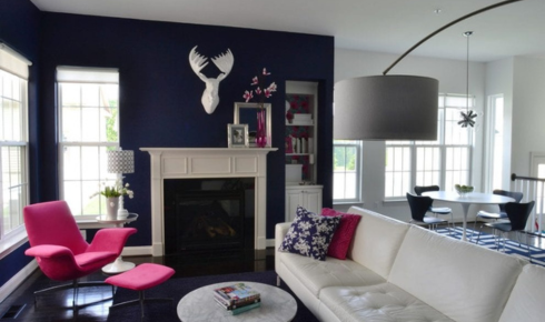
Also consider the direction the room faces. North-facing (or naturally cool) rooms can make colours appear deeper and greyer. In those, darker shades feel heavier.
If you love the colour but it feels too much, you can use it on a single accent wall or choose a lighter version from the same colour strip. Testing on the actual wall is the only way to really know.